Editorial Design & Magazine Layout System
Project Description:
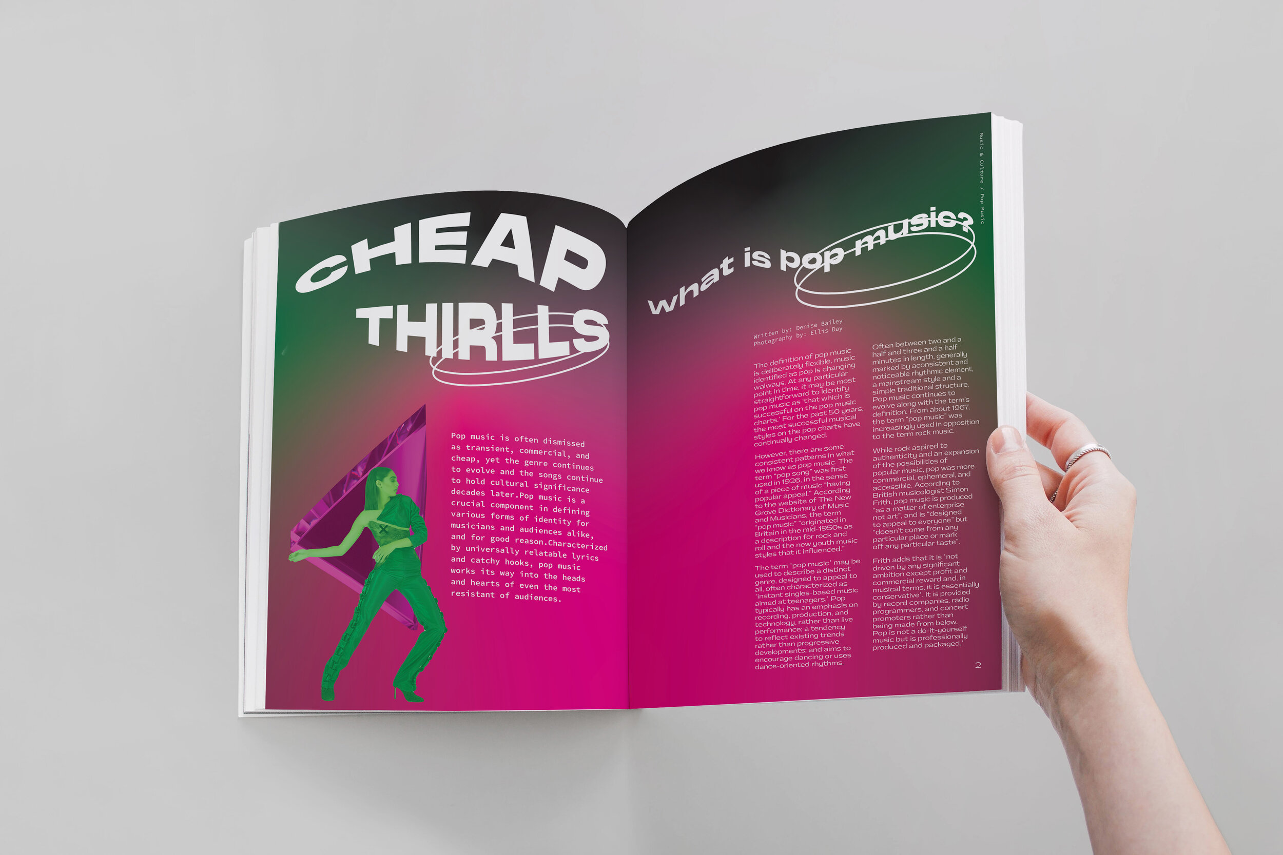
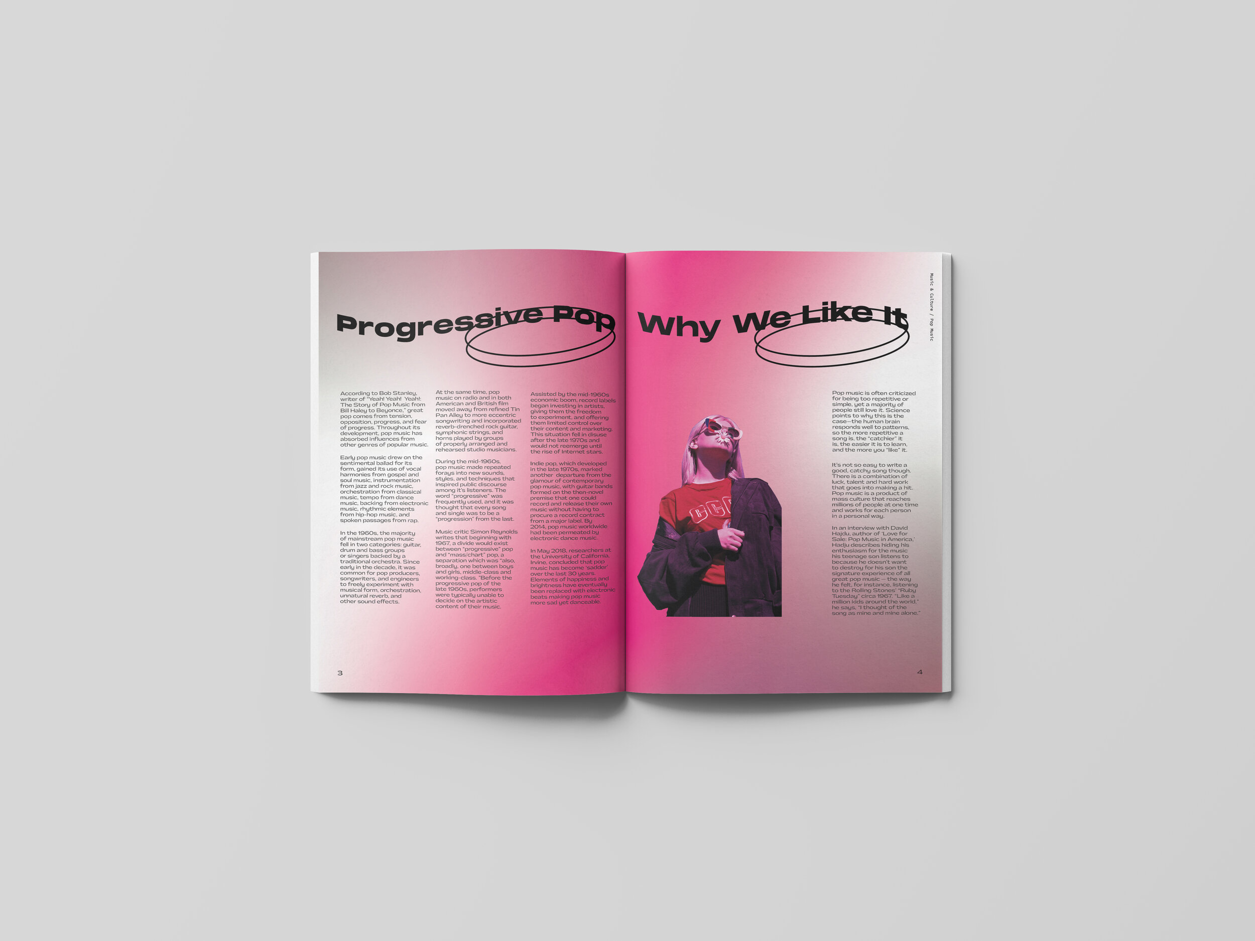
This editorial design project explores the relationship between typography, imagery, and storytelling through a series of magazine spreads focused on music, culture, and contemporary pop culture topics. The objective was to create an engaging reading experience that balanced strong visual impact with clarity, readability, and editorial structure.
The project began with an exploration of how typography can influence the way readers navigate and absorb content. Rather than treating type as a supporting element, the layouts position typography as a core storytelling device. Hierarchy, pacing, scale, and rhythm were carefully considered to guide readers through long-form content while maintaining visual interest across multiple spreads.
A modular grid system was developed to create consistency throughout the publication while allowing each article to establish its own visual personality. Image sourcing, photo manipulation, and editorial composition were used to create dynamic relationships between text and imagery, ensuring that every spread felt cohesive, immersive, and purposeful. Large-format headlines, pull quotes, and editorial pacing techniques were incorporated to break up dense content and encourage exploration.
Particular attention was given to typographic refinement, including hierarchy systems, spacing, alignment, readability, and visual flow. The resulting publication demonstrates how editorial design can transform information into an engaging visual narrative, creating moments of emphasis, discovery, and emotional connection throughout the reading experience.